Branding & Print · 2024
The Everyday Men × Isetan KLCC
A 14-day Christmas booth activation — turning free engraving into the reason customers stopped, chose, and bought.
The problem
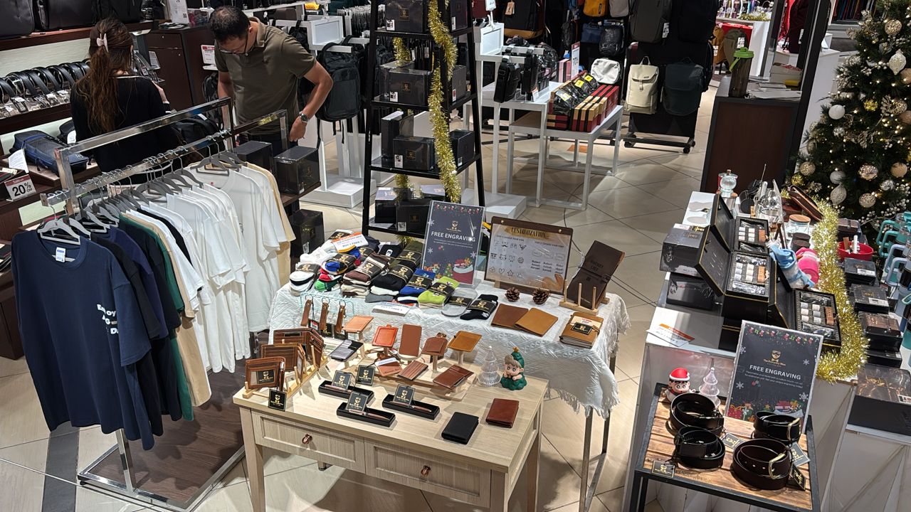
The Everyday Men secured a Christmas season booth at Isetan KLCC — prime location, high foot traffic, but a difficult shared floor. The surrounding brands sold the same category of men’s gifts: leather wallets, belts, tumblers, backpacks. From ten metres away, every booth looked interchangeable.
Day one confirmed the concern. Sales came in below expectation. Customers walked past, glanced, and kept moving. The visual pull alone wasn’t converting foot traffic into stops.
The strategic turn
The commercial answer was to make free engraving the headline offer — every leather gift, tumbler, and wood product could be personalised on the spot at no additional cost. Free engraving turned an interchangeable product into a small, on-the-day gift service — meaningful for Christmas shoppers looking for something that felt personal.
My job as designer was to make sure this offer was legible from a distance, obvious up close, and easy to act on the moment someone stopped at the booth.
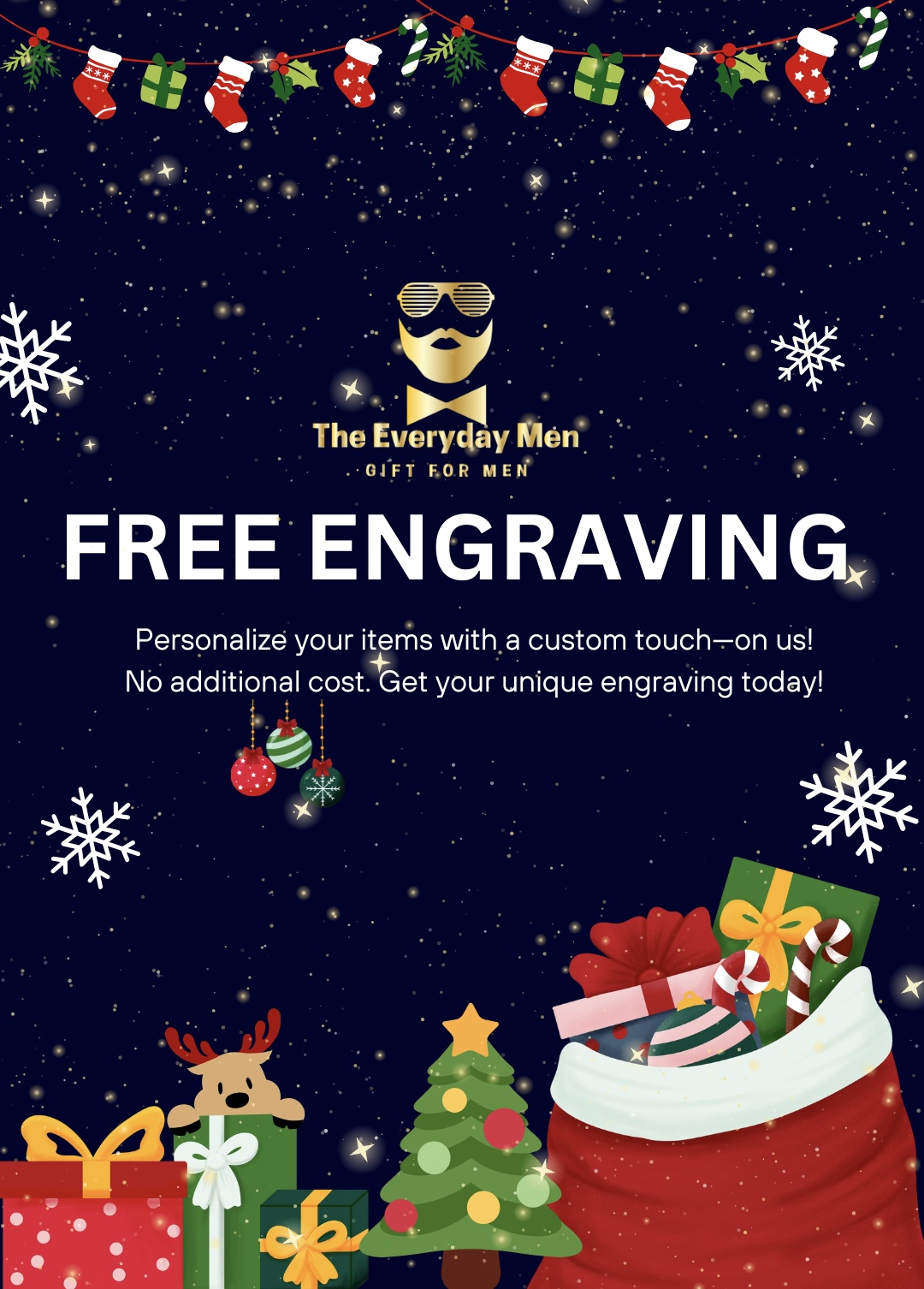
The same design system carried across Instagram Stories and printed booth signage.
Design approach
The design system had to do two jobs at once — feel unmistakably festive to earn a Christmas shopper’s attention, and keep The Everyday Men’s brand identity front and centre so the booth wouldn’t get mistaken for generic seasonal decoration.
I anchored every piece on the brand’s existing dark navy ground and gold logotype, then let Christmas illustrations sit at the edges of the composition — stockings garland at the top, gift-pile at the bottom, snowflakes as breathing room. “FREE ENGRAVING” is the largest type on every layout, so the offer is legible before you’ve read any brand name.
A campaign system, not a one-off
The same design travelled across three touchpoints — an Instagram Story graphic to draw people to the booth, printed A4 posters slipped into acrylic display holders around the table, and a physical customization menu on a wooden clipboard at the point of sale. Same message, same visual language, each format tuned for its context.
A two-step chooser to remove friction
The customization menu was the most important design decision. Rather than asking customers to specify what they wanted from scratch, I laid it out as a two-step chooser: Step 1 — Choose Your Icon. Step 2 — Choose Your Font. A grid of icons (initials, symbols, small motifs) and a short list of font samples turned a potentially intimidating “what would you like engraved?” into a five-second selection. Once customers made the two choices, they had already mentally committed to the purchase.
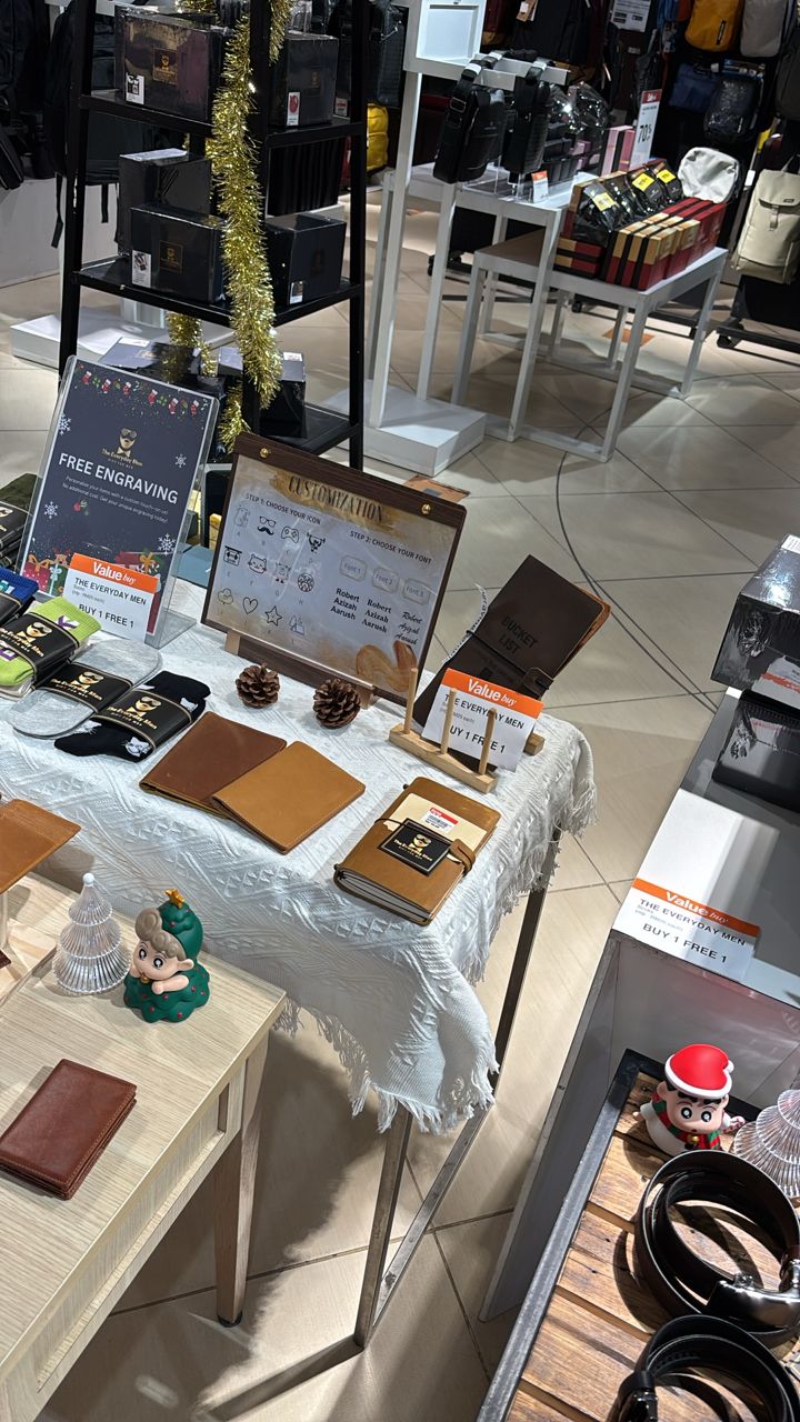
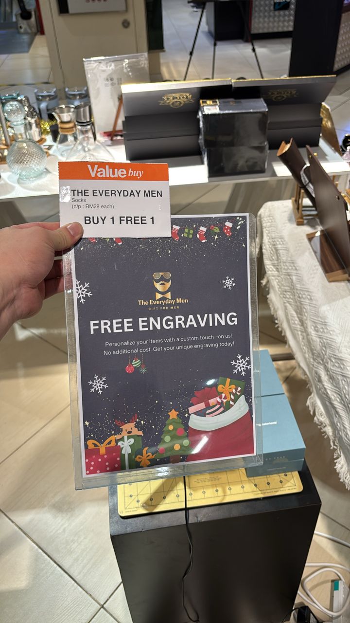
The wooden customization menu at the point of sale, and printed signage in acrylic holders around the booth.
Day one sales came in below expectation. From day two, once the free engraving campaign was live at the booth, sales came in — and continued across the remaining thirteen days of the run.