Client: Hakka Kopitiam @家的味道, Taman Gembira, Kuala Lumpur
Role: Designer
Year: 2024
Tools: Adobe Illustrator
Category: Print Design
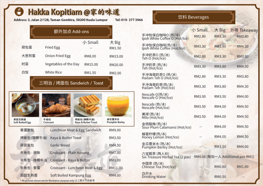
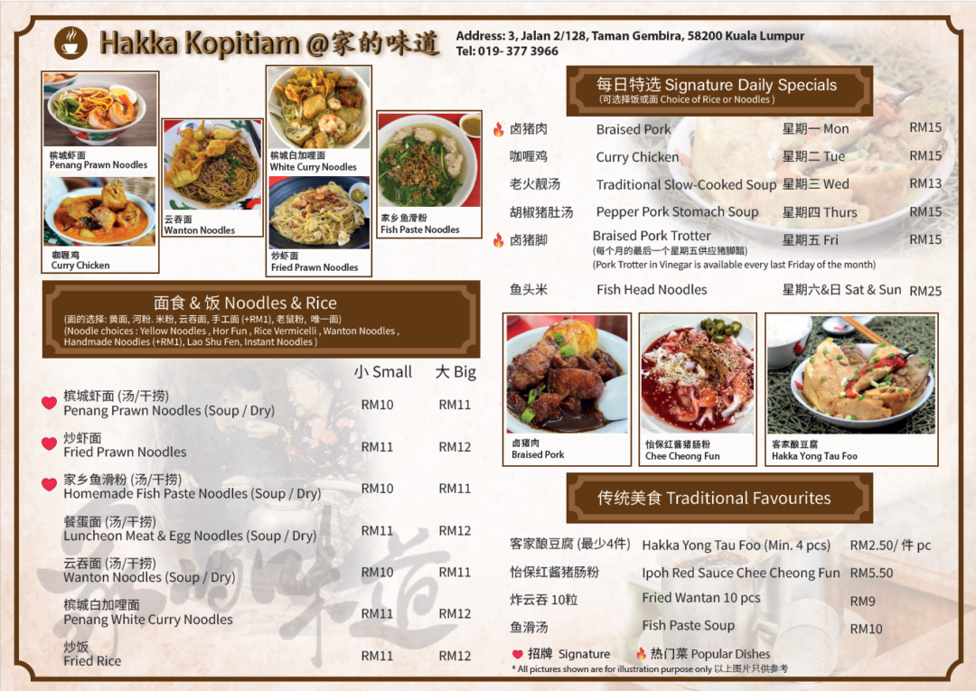
Hakka Kopitiam — From Chalkboard to Printed Menu
A bilingual two-page menu designed for a long-running Hakka kopitiam in Kuala Lumpur — the shop’s first printed menu in years of operation.
The problem
Hakka Kopitiam @家的味道 had been serving the Taman Gembira neighbourhood for years, but had never had a proper menu. Dishes and prices were written in chalk on a blackboard inside the shop. As a customer, I noticed I’d often walk past without going in — I couldn’t see what was on offer or how much it cost from outside. When I mentioned this to the owners (introduced through a mutual friend), it turned into a paid commission to design their first printed menu.
The brief
Give the kopitiam a menu that customers can read at a glance, in both Chinese and English, while keeping the warm, home-style character the shop is known for. The dish “家的味道” — home’s flavour — had to come through in the design, not just the name.
Design approach
I leaned into deep browns, cream, and soft gold accents — the colours of dark coffee and well-worn wood — to echo the feel of a traditional kopitiam. Ribbon-style banners frame each section header, giving the menu a touch of traditional Chinese signage while keeping the composition clean and easy to scan.
Key design decisions
Bilingual typography. Every dish appears in Chinese and English. I paired a clean sans-serif for the English with a softer Chinese typeface, and tuned the spacing so neither language dominated the other.
Hierarchy across two pages. Page one leads with signature dishes and noodles — what most customers come for. Page two handles add-ons, toast and sandwiches, and the full beverage list. Banner headers and consistent column structures make the menu readable from across a table.
Photography as anchors. Rather than illustrating every dish, I selected a small set of strong food photos and placed them as visual anchors, giving the eye somewhere to rest between dense pricing blocks.
Pricing made obvious. Small/Big variants and beverage takeaway prices are aligned in clean right-hand columns so customers can compare at a glance — the opposite of squinting at a chalkboard from the doorway.
Tools
Adobe Illustrator
Outcome
The menu is now printed and in daily use at the shop, replacing the original chalkboard.